In order to lay out your views in an Android App, Android provides you with a number of different Layout Managers. RelativeLayout, for example, allows Views to be placed in relation to the bounds of their parents, as well as in relation to each other. TableLayout and GridLayout present Views in Rows and Columns, with TableLayout allowing views to span multiple columns, and GridLayout to span multiple rows and columns. These pre-defined Layout Managers cover a large number of everyday situations. However, if you cannot find a layout fulfilling your needs, it is actually quite simple to define your own.
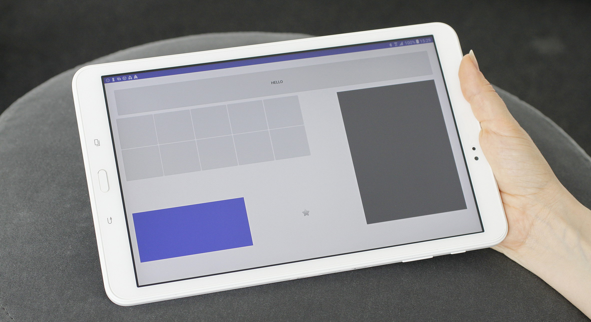
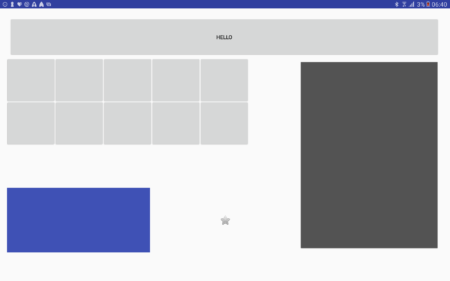
For one of our applications I needed a layout similar to GridLayout: Views put into rows and columns, with the option to span multiple rows and columns. However, each row and column should have the same height and width, respectively. So, if the full width available to a layout is x pixel, and the layout has n columns, each column should be exactly x/n pixel. The following image shows a simple example.
So, why did I not use GridLayout mentioned above? GridLayout aligns Views in rows and columns and allows them to span multiple cells. Views are laid out according to the layout parameters specified for each view. The Layout is also dealing with excess space. However, it is not quite as simple to define a layout where each row and column is exactly the same size. Well, that was what I needed so I defined my own layout that I named FixedCellGridLayout.
A Layout in Android consists of:
- Styling Attributes for the layout class, specified using a <declare-styleable> resource element
- The layout class, a (direct or indirect) subclass of android.view.ViewGroup
And, if you want to use custom layout parameters for the layout:
- The layout parameters class, a subclass of ViewGroup.LayoutParameter
- Styling attributes for the layout parameters
Styling Attributes
These are custom attributes for your view that are used in the specification in a layout xml file. For the FixedCellGridLayout the following definition is used:
<declare-styleable name="FixedCellGridLayout">
<!-- The number of rows to create. -->
<attr name="rowCount" format="integer" />
<!-- The number of columns to create. -->
<attr name="columnCount" format="integer" />
</declare-styleable>
This means that our new Layout defines two additional attributes: rowCount and columnCount, i.e. the number of rows and columns in the layout.
Layout class implementation
The base class for a layout (ViewGroup) does much of the basic work of the layout as a View, so in general it is enough to implement two methods[1]:
onMeasure(widthMeasureSpec: Int, heightMeasureSpec: Int)
Called by the layouting process to determine the eventual size of the view that is rendered, and used by a Layout to request all child views to measure themselves. In other words, the layout has to calculate the place available to itself, and, in this special case, to calculate the size of each of its children. The first part is easy: since the layout does not have to do anything special it simply forwards the call to super.onMeasure – letting the Viewgroup implementation do its work. Using the results of the call (getMeasuredWidth and getMeasuredHeight) it can now start to measure all the children, taking the padding for this view, and the layout margins for the children into account. The important part: since this layout manager forces the layout on the child views, it needs them to measure themselves with the exact specification calculated (indicated by MeasureSpec.EXACTLY).
val childWidthMeasureSpec =  MeasureSpec.makeMeasureSpec(columnMeasurement, MeasureSpec.EXACTLY)
val childRowHeightSpec = MeasureSpec.makeMeasureSpec(rowMeasurement, MeasureSpec.EXACTLY)
child.measure(childWidthMeasureSpec, childRowHeightSpec)
- onLayout(changed: Boolean, left: Int, top: Int, right: Int, bottom: Int)
This is the final pass of the layouting process. Here, the exact coordinates for the borders of the child views are calculated, again taking layout margins of its children into account.
val left = l + columnWidth * columnIndex + paddingLeft + layoutMarginLeft
val right = left + columnSpan* columnWidth -layoutMarginRight - layoutMarginLeft
val top = t + rowHeight * rowIndex + paddingTop + layoutMarginTop
val bottom = top + rowHeight * rowSpan - layoutMarginBottom - layoutMarginTop
// layout the child with the calculated coordinates
child.layout(left, top, right, bottom)
Custom Layout Parameters
Since I allow margins for the child views in the Layout, FixedCellGridLayout.LayoutParams extends ViewGroup.MarginLayoutParams. The implementation itself is quite simple: a constructor, and four additional properties which specify the rows and columns the view should be put into. Similarly to our base GridLayout, this layout allows a row and column index, and a row and column span, but handles it a bit differently, as specified above. Additionally, we provide default values for layout_width and layout_height, since this implementation ignores those parameters.
class LayoutParams constructor(context: Context, attributeSet: AttributeSet? = null): ViewGroup.MarginLayoutParams(context, attributeSet) {
var row = 0
var column = 0
var rowSpan = 1
var columnSpan = 1

// initializer
init {
if (attributeSet != null) {
val a = context.obtainStyledAttributes(attributeSet, R.styleable.FixedCellGridLayout_LayoutParam)
row = a.getInt(R.styleable.FixedCellGridLayout_LayoutParam_row, 0)
column = a.getInt(R.styleable.FixedCellGridLayout_LayoutParam_column, 0)
rowSpan = a.getInt(R.styleable.FixedCellGridLayout_LayoutParam_rowSpan, 1)
columnSpan = a.getInt(R.styleable.FixedCellGridLayout_LayoutParam_columnSpan, 1)
a.recycle();
}
}

override fun setBaseAttributes(a: TypedArray?, widthAttr: Int, heightAttr: Int) {
width = ViewGroup.LayoutParams.MATCH_PARENT;
height = ViewGroup.LayoutParams.MATCH_PARENT;
}
}
Layout Parameter Styling Attributes
Finally, I needed to define styling attributes for the LayoutParams. This is similar to the definition of class styling.
<declare-styleable name="FixedCellGridLayout_LayoutParam"> <!-- Row index (starting with 0)--> <attr name="row" format="integer" /> <!-- Column index index (starting with 0)--> <attr name="column" format="integer" /> <!-- Number of rows to span--> <attr name="rowSpan" format="integer" /> <!-- Number of columns to span--> <attr name="columnSpan" format="integer" /> </declare-styleable>Using the LayoutParams in the Layout class
As a final step we have to use the new LayoutParams class in the Layout. This is done by overriding four methods from ViewGroup, as shown below.
// Generate a default set of Layout Parameters (used in addView without any parameter object
override fun generateDefaultLayoutParams() = LayoutParams(context)

// Generate LayoutParams based on an attribute Set
// this method is for example called whenever a child view is added via xml
override fun generateLayoutParams(attrs: AttributeSet?)= LayoutParams(context, attrs)

//  this method is called to
// create "save" layoutParams based on the provided ones
override fun generateLayoutParams(p: ViewGroup.LayoutParams?): LayoutParams {
    if (checkLayoutParams(p)) {
        return p as LayoutParams
    }
    val lp = generateDefaultLayoutParams();
    if (p is MarginLayoutParams) {
        // copy margins from original parameters
        lp.setMargins(p.leftMargin, p.topMargin, p.rightMargin, p.bottomMargin);
    }
    return lp;
}

// this method should return false when a wrong type of  LayoutParams was provided with addView
// -> so we check for the correct type
override fun checkLayoutParams(p: ViewGroup.LayoutParams?) = p is LayoutParams
Finally, the Layout can be used like this:
<at.srfg.layout.FixedCellGridLayout
   xmlns:android="http://schemas.android.com/apk/res/android"
   xmlns:app="http://schemas.android.com/apk/res-auto"
   xmlns:tools="http://schemas.android.com/tools"
   android:layout_width="match_parent"
   android:layout_height="match_parent"
   app:columnCount="9"
   app:rowCount="11"
   android:id="@+id/layout"
   android:paddingLeft="20dp"
   android:paddingRight="20dp"
   android:paddingTop="20dp"
   android:paddingBottom="20dp"
   tools:context="at.srfg.fit4aal.container.MainActivity"
   >

   <ImageView
      android:id="@+id/toolbar"
      app:column="0"
      app:columnSpan="9"
      app:rowSpan="2"
      android:layout_width="match_parent"
      android:layout_height="match_parent"
      android:layout_marginTop="10dp"
      android:layout_marginLeft="10dp"
      android:layout_marginRight="10dp"
      android:layout_marginBottom="10dp"
      android:src="@drawable/header"
      android:scaleType="fitXY"
      tools:ignore="ContentDescription"/>
You’ll notice when looking at the layout xml file, that the custom attributes defined for the Layout and the Layout parameters are in a namespace different then “http://schemas.android.com/apk/res/android” (the “android” namespace alias). This namespace contains all attributes predefined by the system. Using this namespace for custom attributes would show up as an error and would not actually build. To tell the system that the parameters are custom, you have to use the ”http://schemas.android.com/apk/res-auto” namespace (the namespace alias is actually up to you – most of the examples for custom styling use the “app” alias, so I used it too), but only if you are using gradle.
If you are not using gradle to build the app, you’ll actually have to provide a more detailed namespace for the attributes that also includes the package name of the custom library used, for example:
http://schemas.android.com/apk/res/at.srfg.layout
That’s all. You can download all resources for this blog here.
[1] All code examples are implemented using Kotlin, but should be understandable even if you do not know the language.